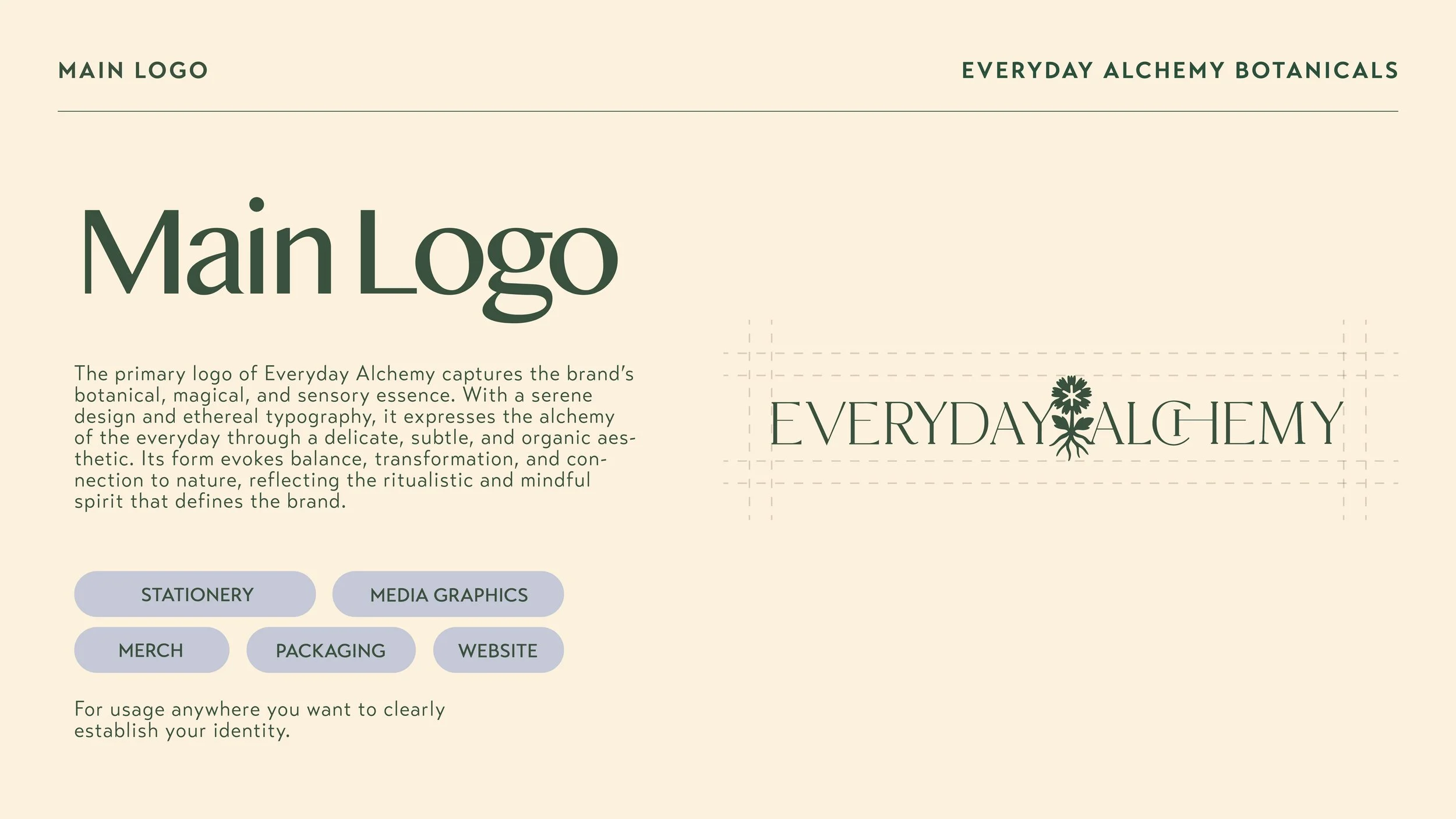
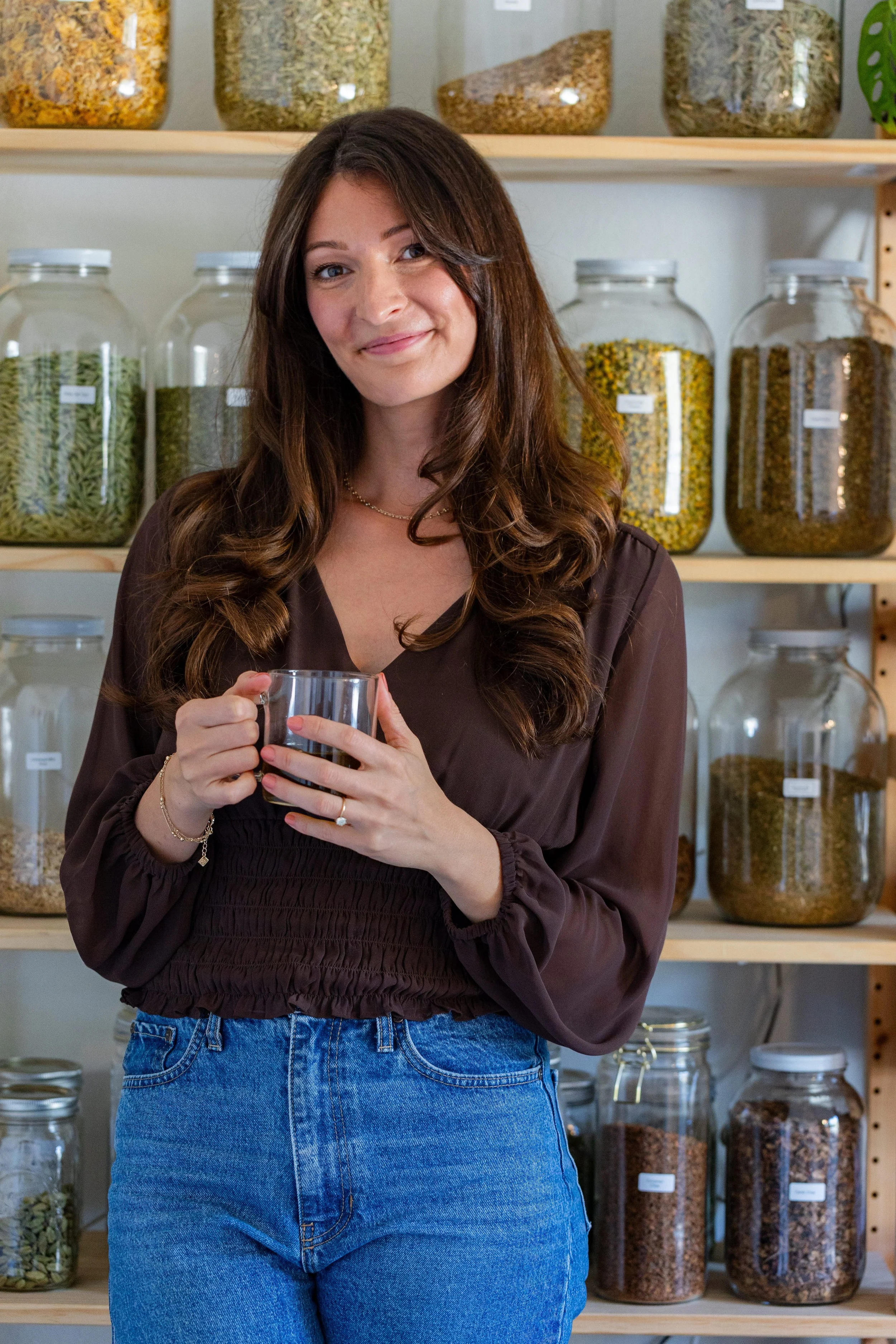
Everyday Alchemy
Everyday Alchemy is a wellness brand centered around the idea that small, intentional rituals can transform the way we move through our day. The brand was reimagined to reflect a more refined, grounded presence within the botanical tea space, balancing natural ingredients with a modern, elevated aesthetic. The visual identity draws from the quiet transformation found in nature, combining earthy tones, botanical textures, and thoughtful typography to create a sense of warmth and clarity.
Scope of Work
-
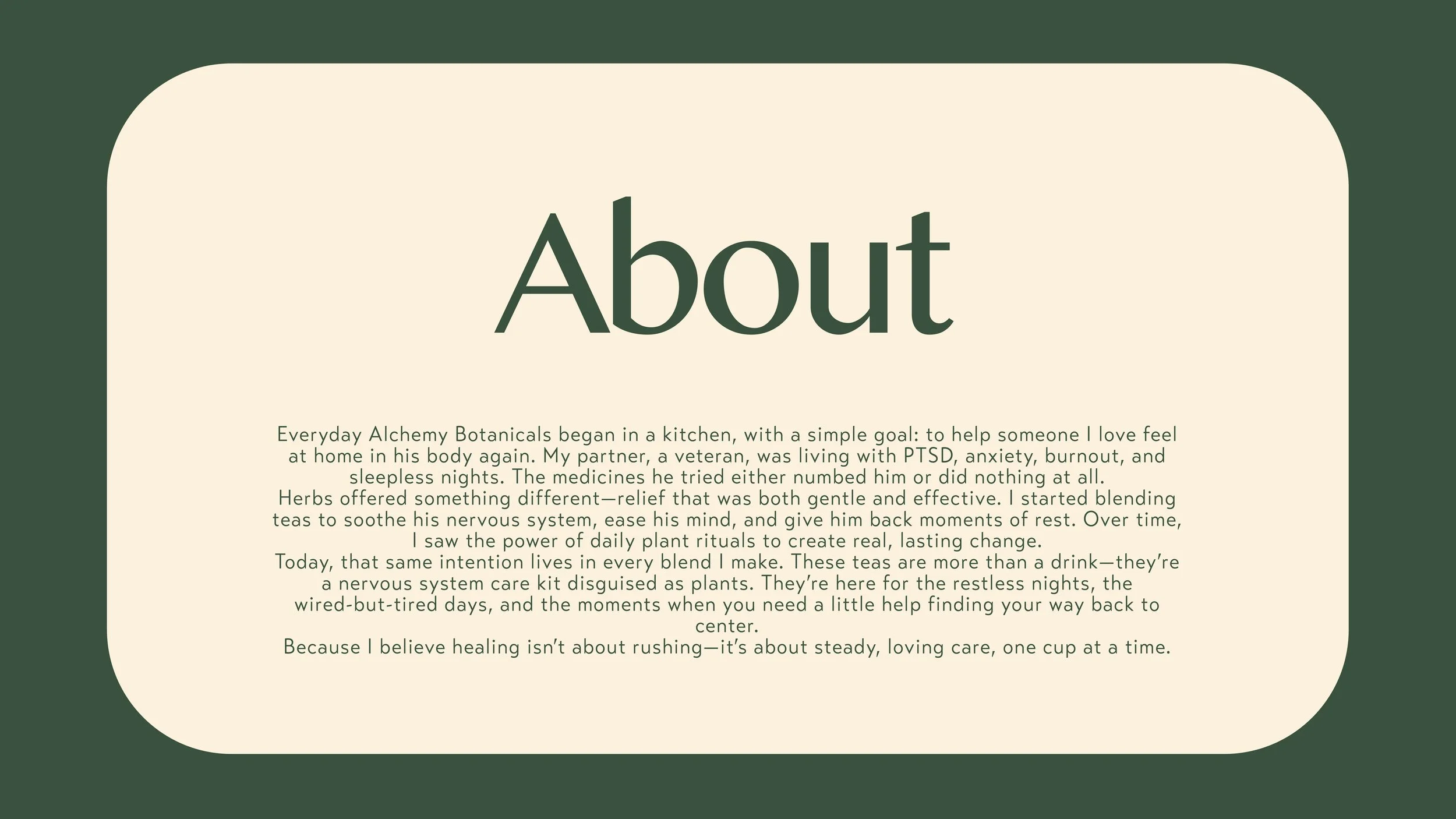
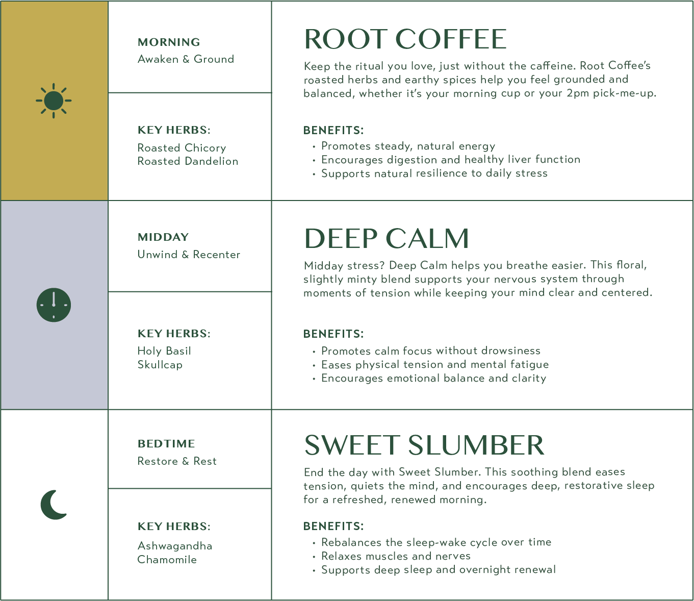
Everyday Alchemy is a wellness brand centered around transforming simple daily rituals into meaningful moments. The product line focuses on herbal blends designed to support energy, digestion, and balance, without relying on caffeine.
The challenge was to evolve the brand from a simple product label into a cohesive, elevated identity that could stand confidently in the growing wellness and botanical beverage space.
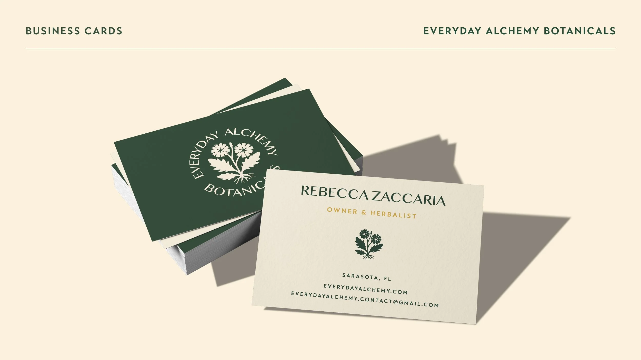
My role included refining the brand identity, redesigning the packaging system, and developing the website experience to ensure the brand felt consistent across every touchpoint.
-
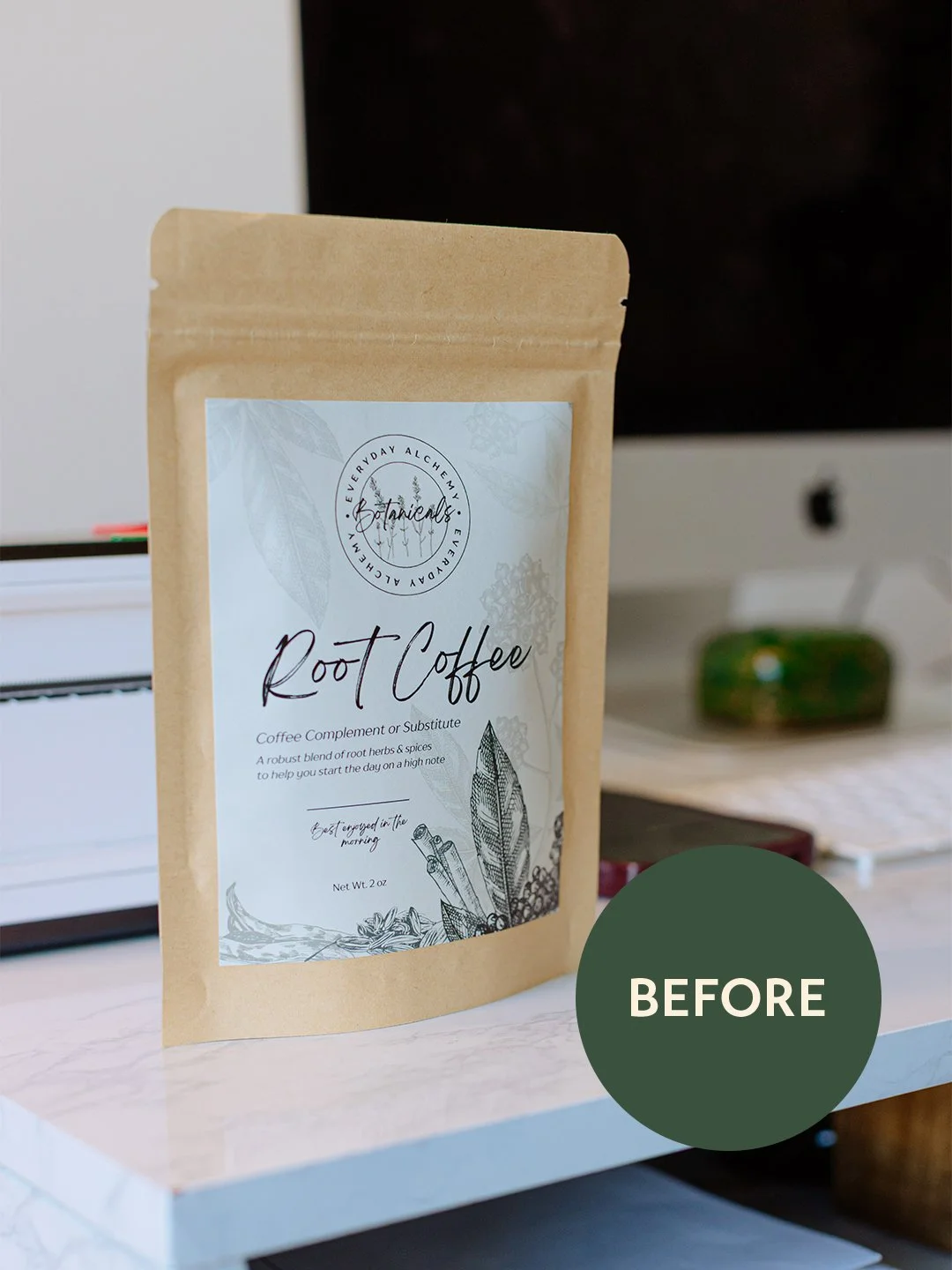
The original packaging communicated the product ingredients, but it lacked the visual clarity and brand presence needed to compete on retail shelves or in an online marketplace.
The design relied heavily on botanical illustrations and script typography, which created a handcrafted aesthetic but made the product feel less structured and harder to scan at a glance.
The goal of the redesign was to:
• Strengthen brand recognition
• Improve product clarity and readability
• Create a more refined, modern wellness aesthetic
• Build a scalable packaging system for future products -
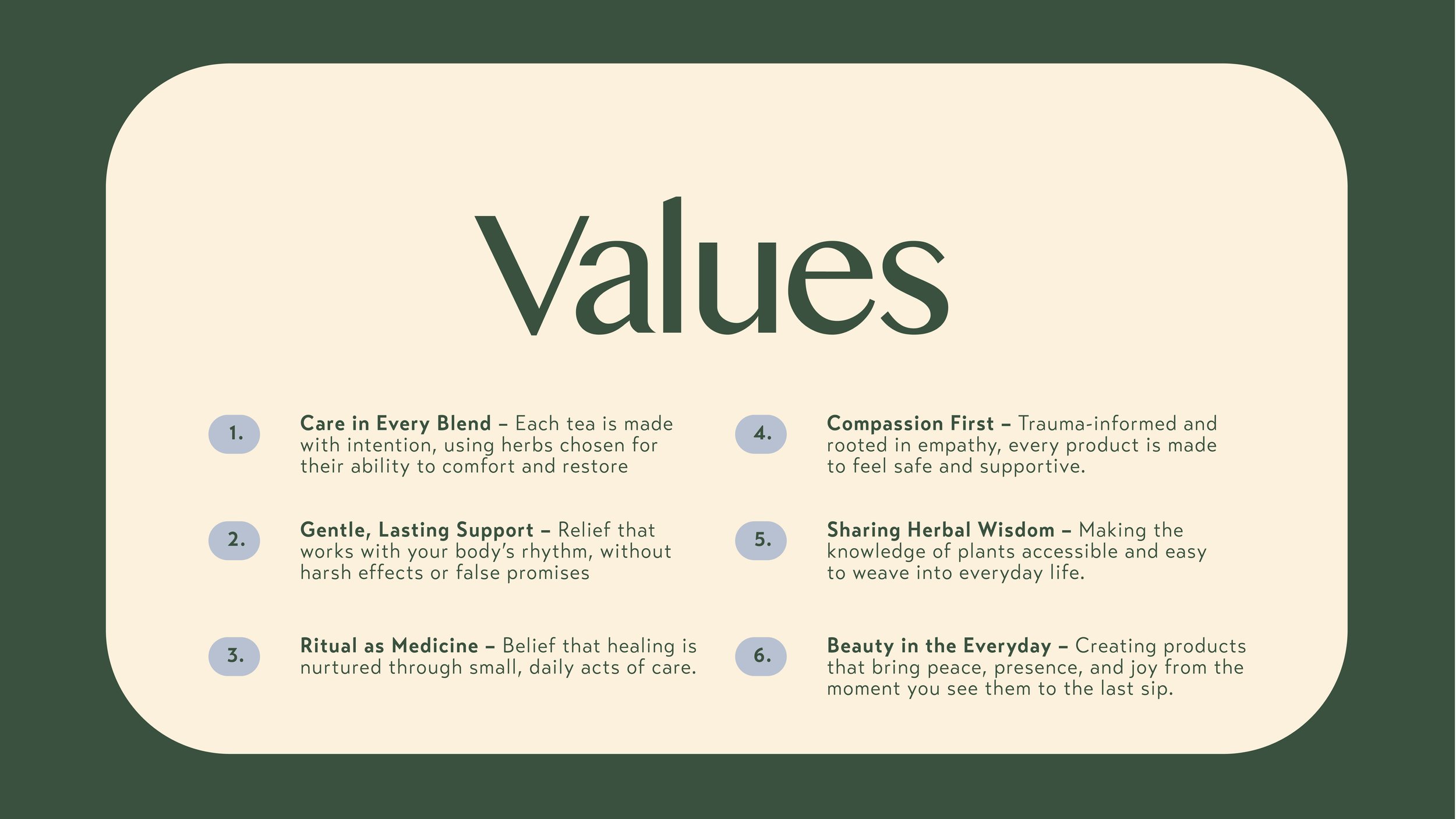
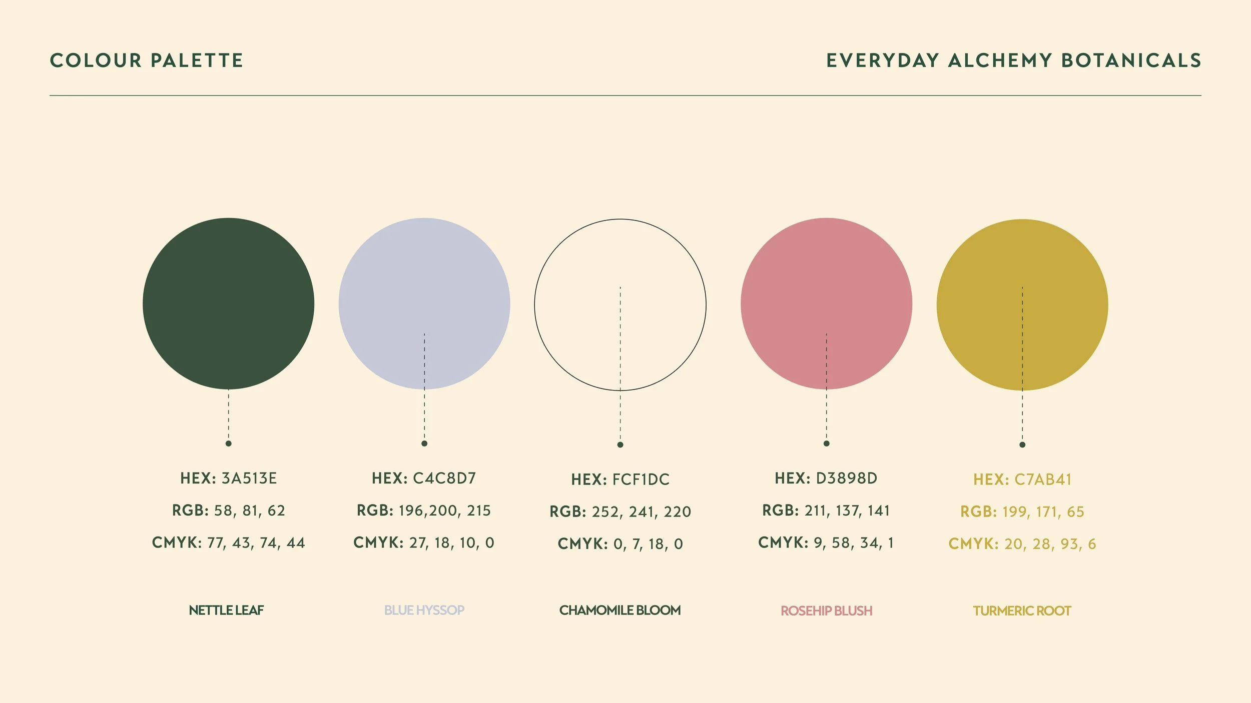
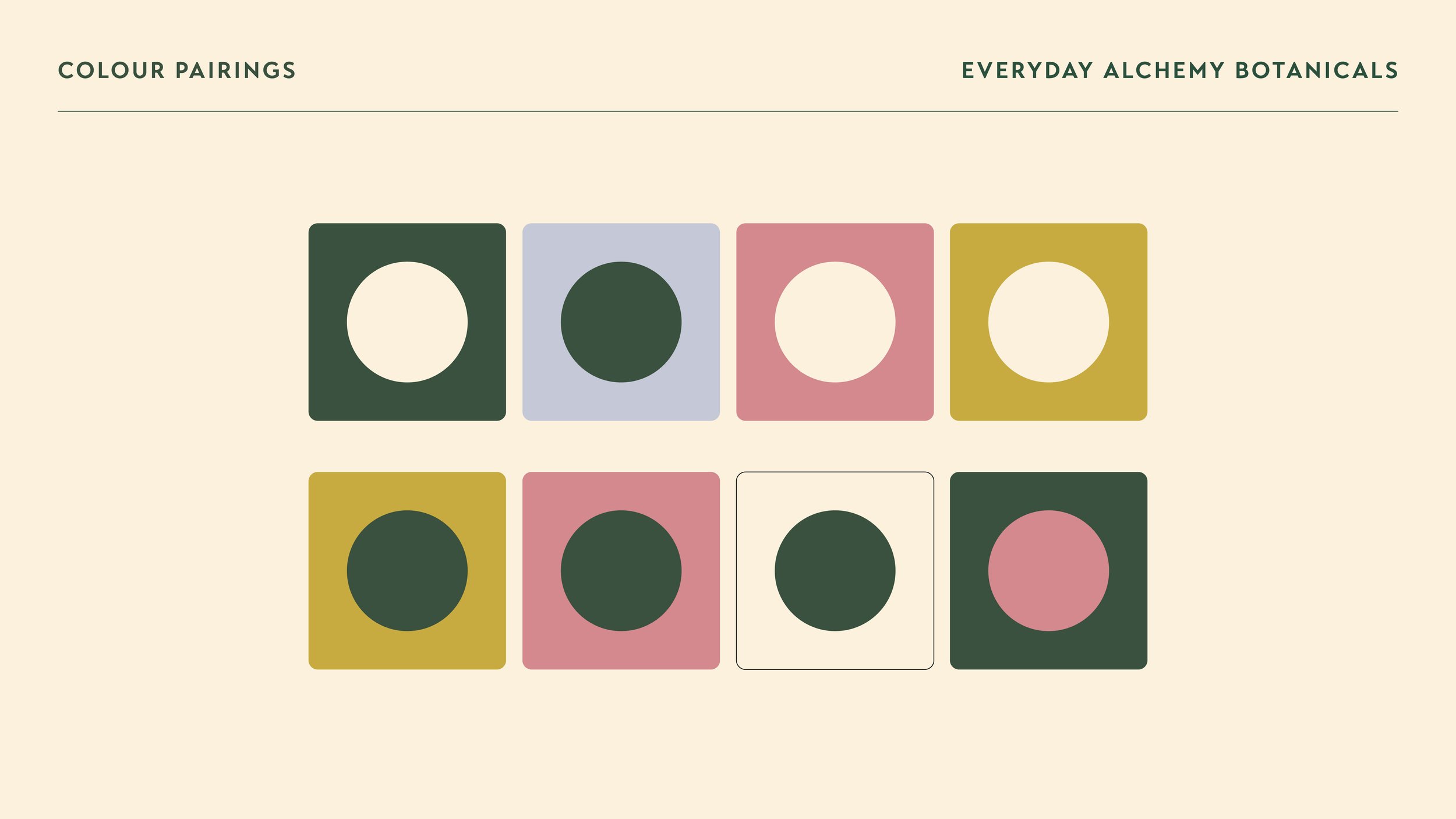
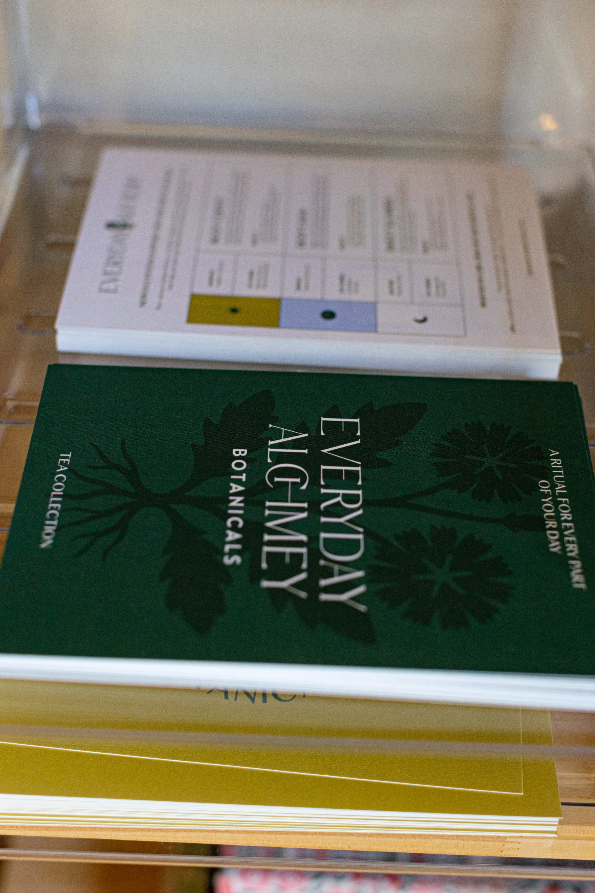
The visual direction for Everyday Alchemy draws inspiration from the idea of natural transformation—the process of turning simple ingredients into something restorative and meaningful.
The updated identity focuses on balance: earthy but refined, natural yet structured.
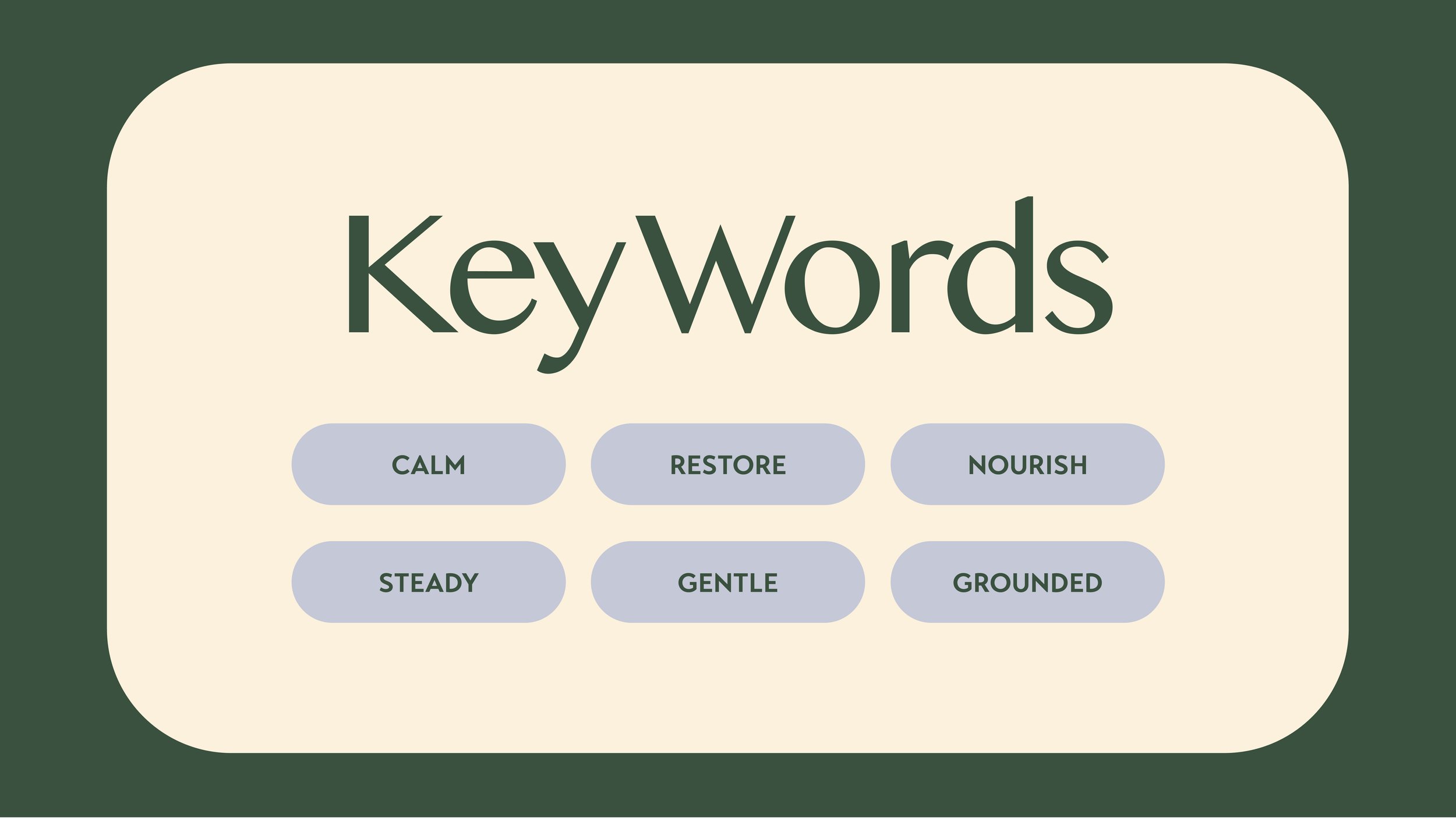
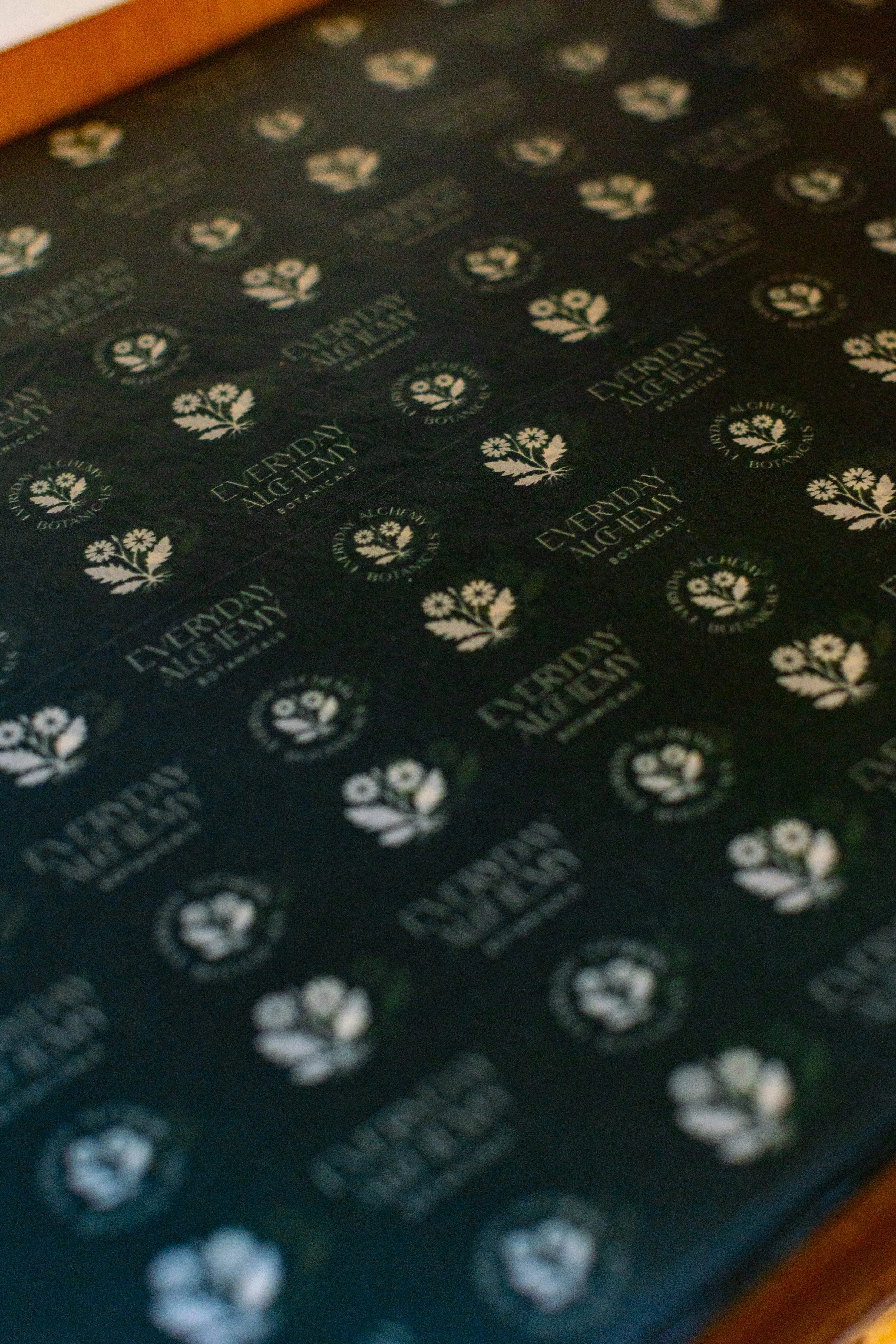
Key elements of the brand include:
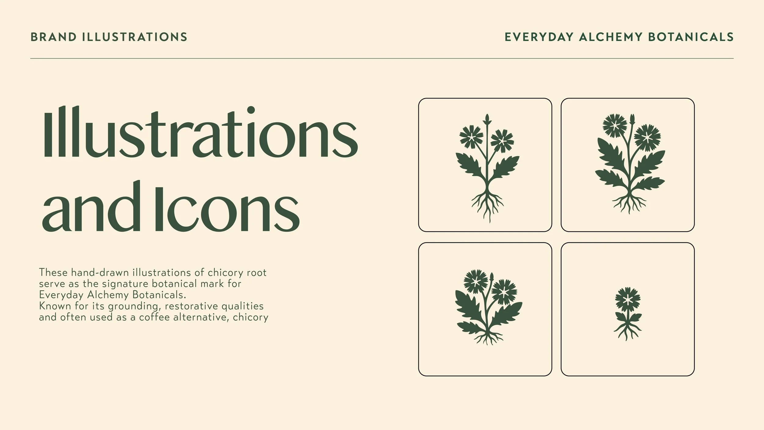
• grounded botanical color palettes
• clear hierarchy for product information
• subtle organic patterns inspired by plant forms
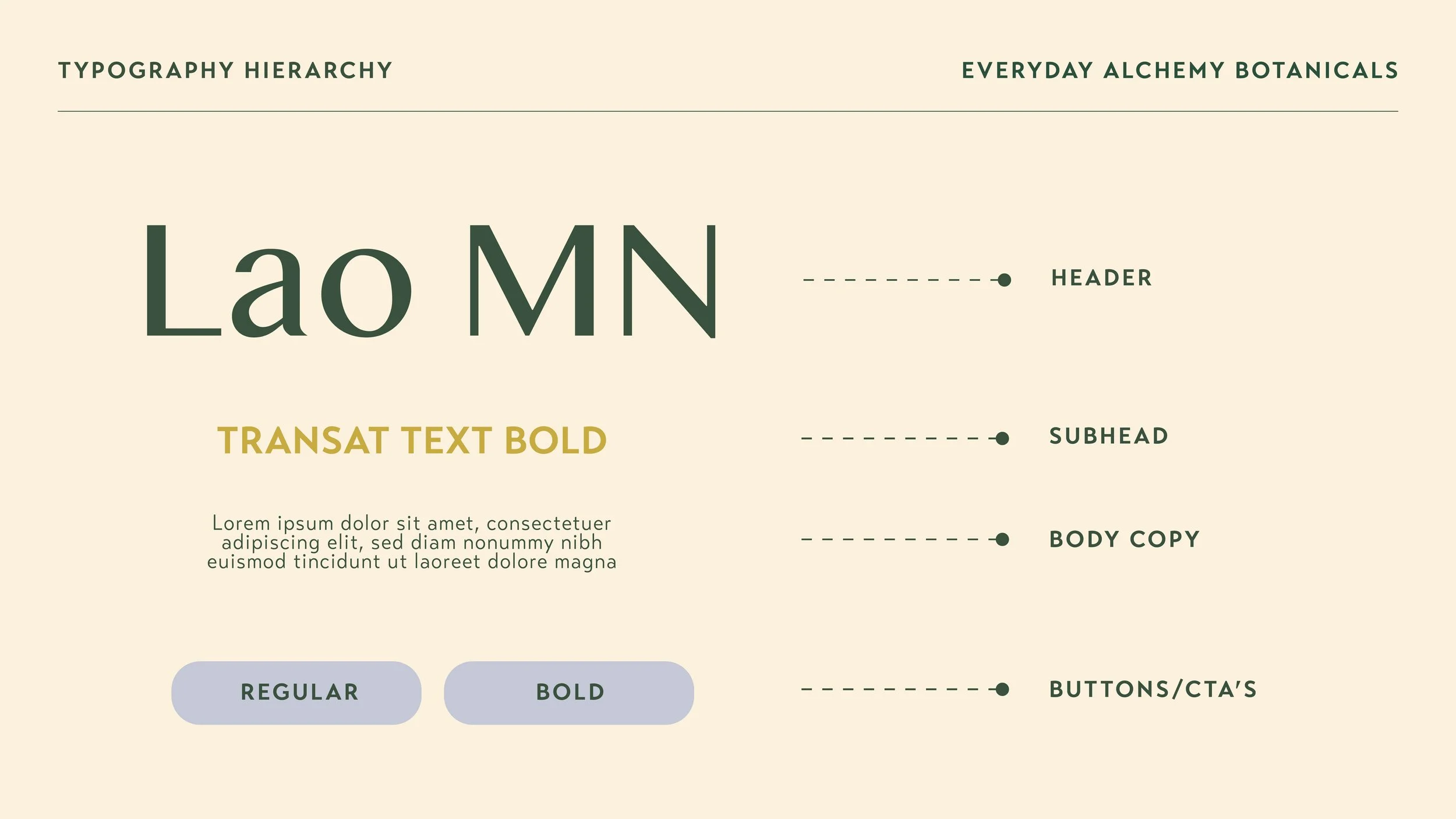
• typography that feels elevated yet approachableThese elements help position Everyday Alchemy within the premium herbal beverage category while maintaining a sense of warmth and authenticity.
-
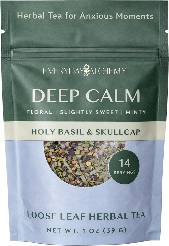
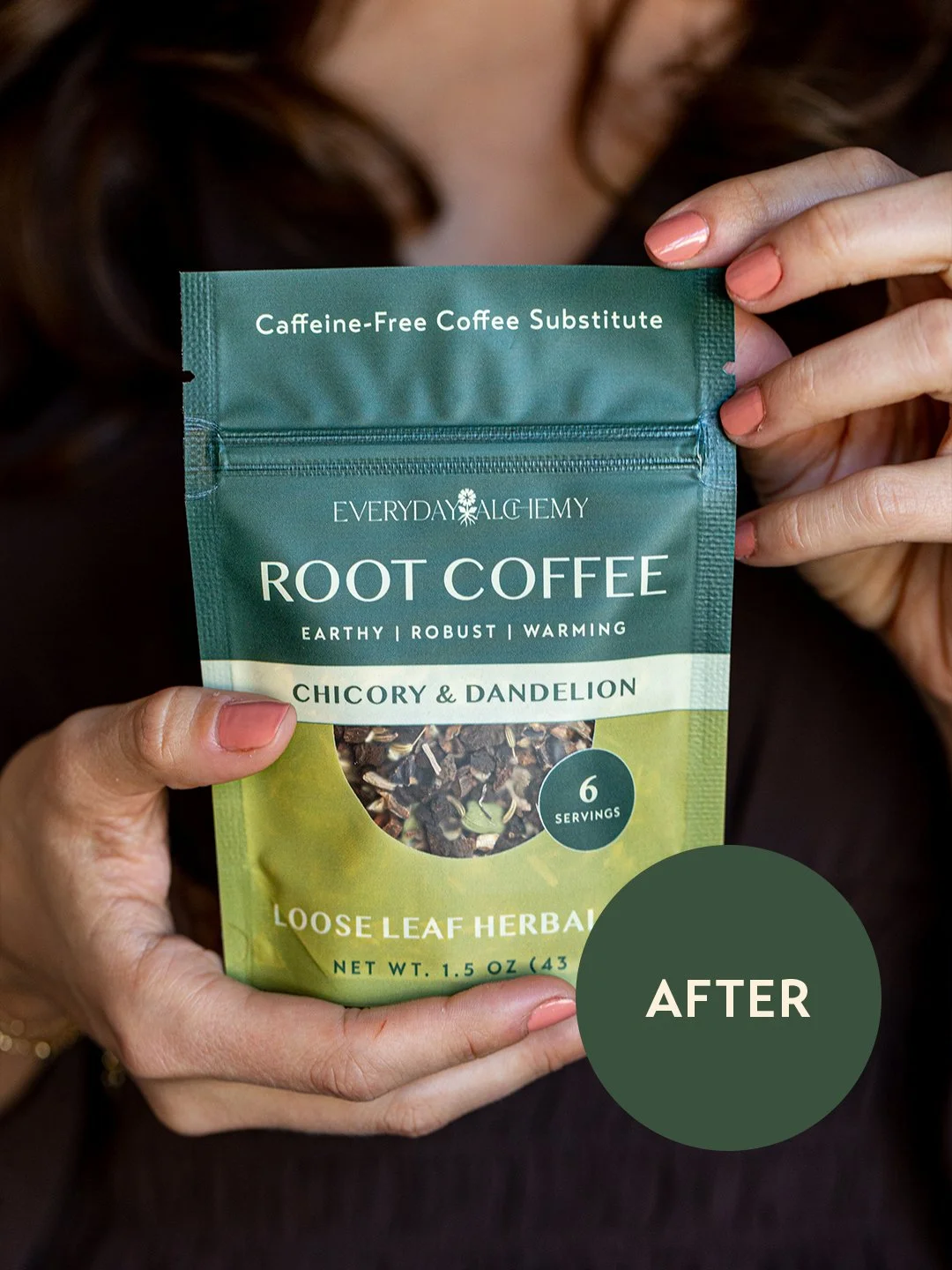
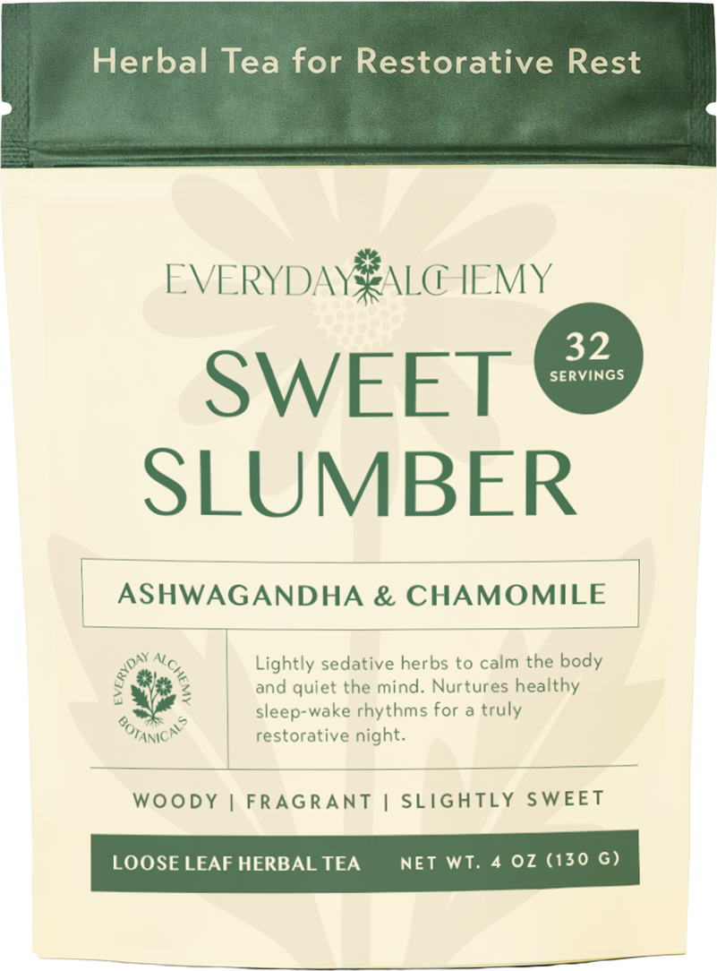
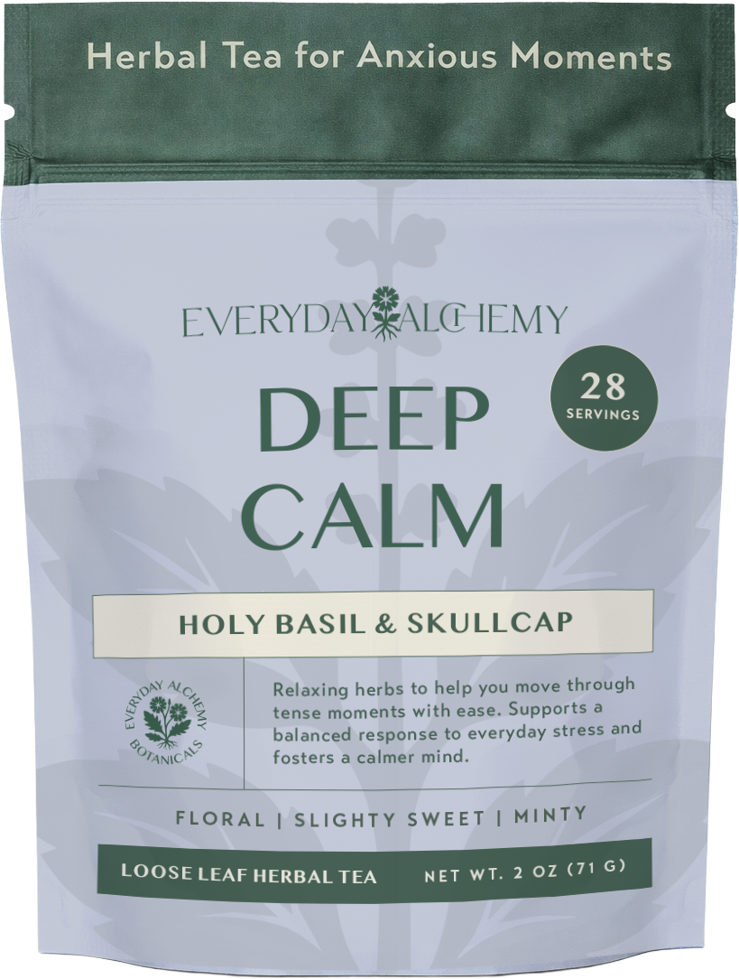
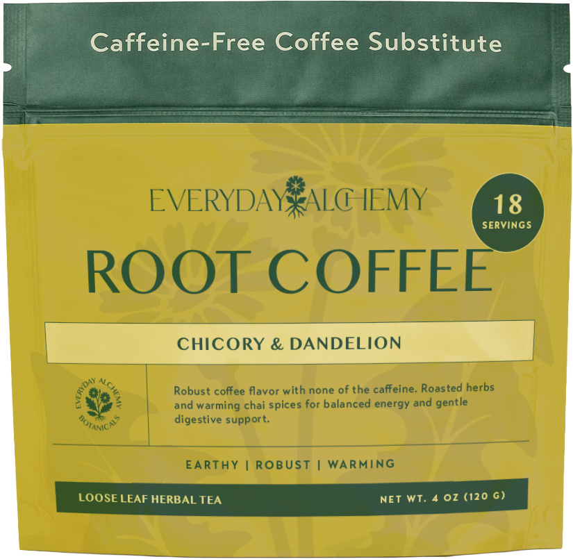
The packaging was redesigned to bring clarity, hierarchy, and brand recognition to the product.
The new layout introduces a stronger structure that allows customers to quickly understand what the product is and what it offers.
Key improvements include:
• Clear product naming and flavor identification
• Stronger brand presence at the top of the package
• Organized information hierarchy for ingredients and benefits
• A refined color palette inspired by botanical ingredients
• Subtle plant textures that add depth without overwhelming the designThe final result creates packaging that feels more polished and confident while still honoring the natural origins of the product.
-
The transformation illustrates how thoughtful design can elevate a product’s presence while improving clarity and usability.
The original design leaned heavily on illustration and script typography, while the redesigned packaging introduces a structured system that balances natural inspiration with modern retail appeal.
The new packaging system also provides a scalable framework for future blends within the Everyday Alchemy line.
-
After establishing the visual identity and packaging system, the brand was extended into the website experience.
The website was designed to mirror the calm, intentional feeling of the products while guiding visitors through the brand story, product offerings, and wellness philosophy.
Typography, spacing, and imagery were carefully considered to create a digital environment that feels both grounded and elevated—reflecting the same thoughtful ritual that the products encourage.
-
The final result is a cohesive brand system that supports Everyday Alchemy’s growth across packaging, digital presence, and future product development.
The redesigned identity helps the brand stand out in the wellness space while communicating its core message clearly: that everyday rituals can be transformative.


Let's get in touch
Let's get in touch
Let’s make something thoughtful, strategic, and way too good to ignore. I’m available via Instagram DMs or right here through my contact form. I’m here and I’d love to hear about your brand.
Let’s get started!

Follow along for a peek at the process, the projects, and the stuff I swear I’m working on.


